“First impressions last.” You may not agree with this phrase, but in business…you surely should.
Many studies have shown that it takes only one second to persuade a new visitor to stay on your site. Meaning all the work you’ve done on the front end, stressing over ad creatives, and spending $$$ on Facebook ads may all be wasted in less than 1 SECOND if your business’s landing page design isn’t up to par.
If you want to run profitable ad campaigns and continue to crush your revenue goals for your E-commerce business, you need to make sure that you have a well-designed landing page that can convert your leads.
A great landing page design and its importance
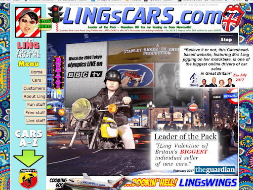
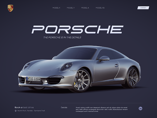
Of these two landing pages, which business are you more likely to trust?
While I admire the hilarity and playfulness of the first one, I’m not sure I can input my credit card details on a website that looked like it was designed by a 13-year-old.
In today’s digital age where trust is one the most valuable currencies, a well-designed landing page can establish authority for your business. It increases the perceived value of your brand and shows new customers that you’re a business worth buying from.
Not only that, but a well-designed landing page can increase your revenue in a psychological sense. It can help guide a user’s line of sight and evoke the right emotions to persuade new visitors to finally hit that checkout button.
The Best Practices in Landing Page Design
1. Make sure the same brand color and visual elements align with your ads
Imagine going on a date with someone you met online, only to be dumbfounded that they look nothing like the photos they had online. Yeah, that’s what it feels like for new visitors when your ads and landing page design don’t align. Haha
Make sure that new customers are assured that they have actually “landed” in the right place after clicking an ad.
Staying consistent with your visuals also makes your brand stronger as people can be more familiar with the “feel” and look of your business.
2. Your design should complement the copy
As much as possible make sure that you use only 2 fonts or fewer. Using more will result in texts looking disorganized.
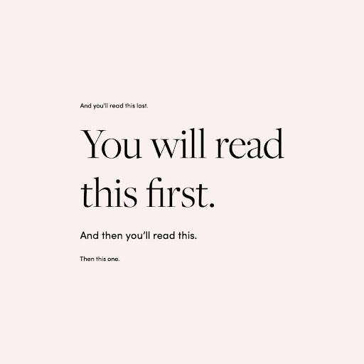
The best converting landing pages make sure that the size, style, and position complement the emphasis on the block of text/copy. This helps guide the reading of visitors and can make the buying process much smoother on their side.
3. Less is more
Remember, upon landing from your Facebook ad, you’ll want your visitor to take only one action. And that is to buy. Putting too many visual elements on your landing page can confuse the visitor.
4. Make sure your page loads quickly
People these days have shorter attention spans. And the longer they wait for your landing page to load, people will either:
A. Put off buying your product for another time. Only to forget it later on.
B. Exit the site in frustration of waiting.
That’s why you need to strive for 3 seconds or less load time. You can do this by optimizing the format and size of your images.
A good landing page can make or break a digital marketing campaign. It goes hand in hand with Facebook ads to capture leads and convert them. That’s why it’s important that you have experts that can help oversee the entire process and give feedback both on your landing page and Facebook ads.
If you’d like to make growing your business feel awesome, not overwhelming…
Then you can talk to one of our experts today by booking a FREE call here: https://dashactivateonline.net
